,,,,,,,,,,,,,,,,,,,,,,,,,,,,,,,,,,,,,,,,,,,,,,,,,,,,,,,,,,,,,,,,,,,,,,

The secret language of colour

Colour is one of the most powerful tools in interior design, yet it's often treated as the finishing touch when we decorate our homes. For Interior Designer and Colour Specialist Mélanie Bernar, that's a missed opportunity. "This common approach misses the true power of colour altogether," she says.

Colour is about far more than whether a room feels fashionable. “It’s a spatial language tool rather than simply an aesthetic choice,” says Mélanie Bernard. “Numerous studies have shown that it influences how we perceive space, our energy levels, our ability to orient ourselves and our sense of calm.”

In other words, colour can affect how we experience a space physically and emotionally and can be used intentionally to create environments that support wellbeing. “Within a holistic approach to space planning, colour becomes a tool for sensory regulation,” Mélanie Bernard explains. “It can support concentration, slow down the pace, create intimacy or, on the contrary, open up a space.”
The floor sets the tone

Walls tend to get most of the attention when colour schemes are discussed, but what about the floor? “Flooring is truly the fundamental element,” says Mélanie Bernard. “The floor is physically the most enveloping surface. It influences our perception of light, depth and grounding.”

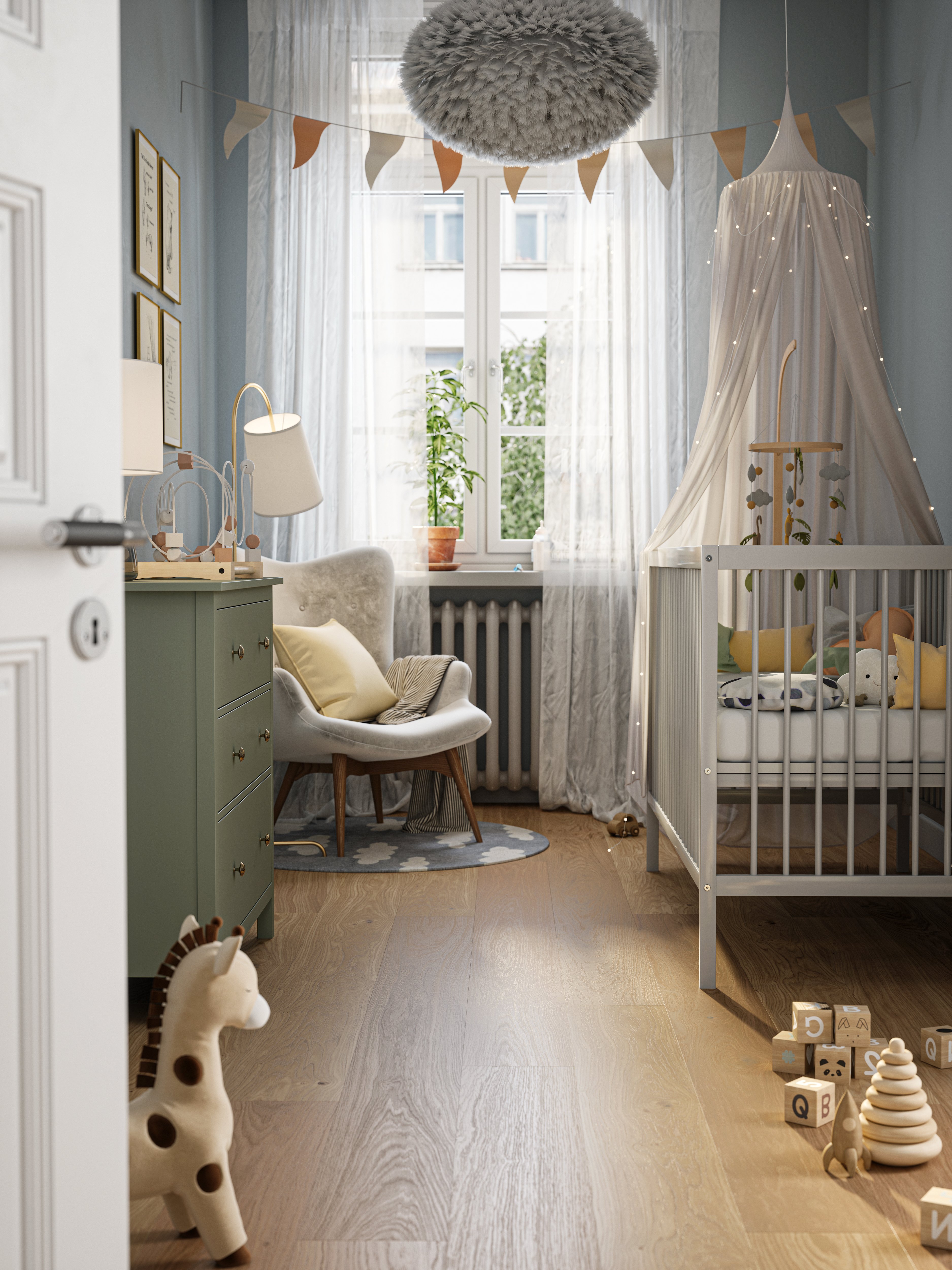
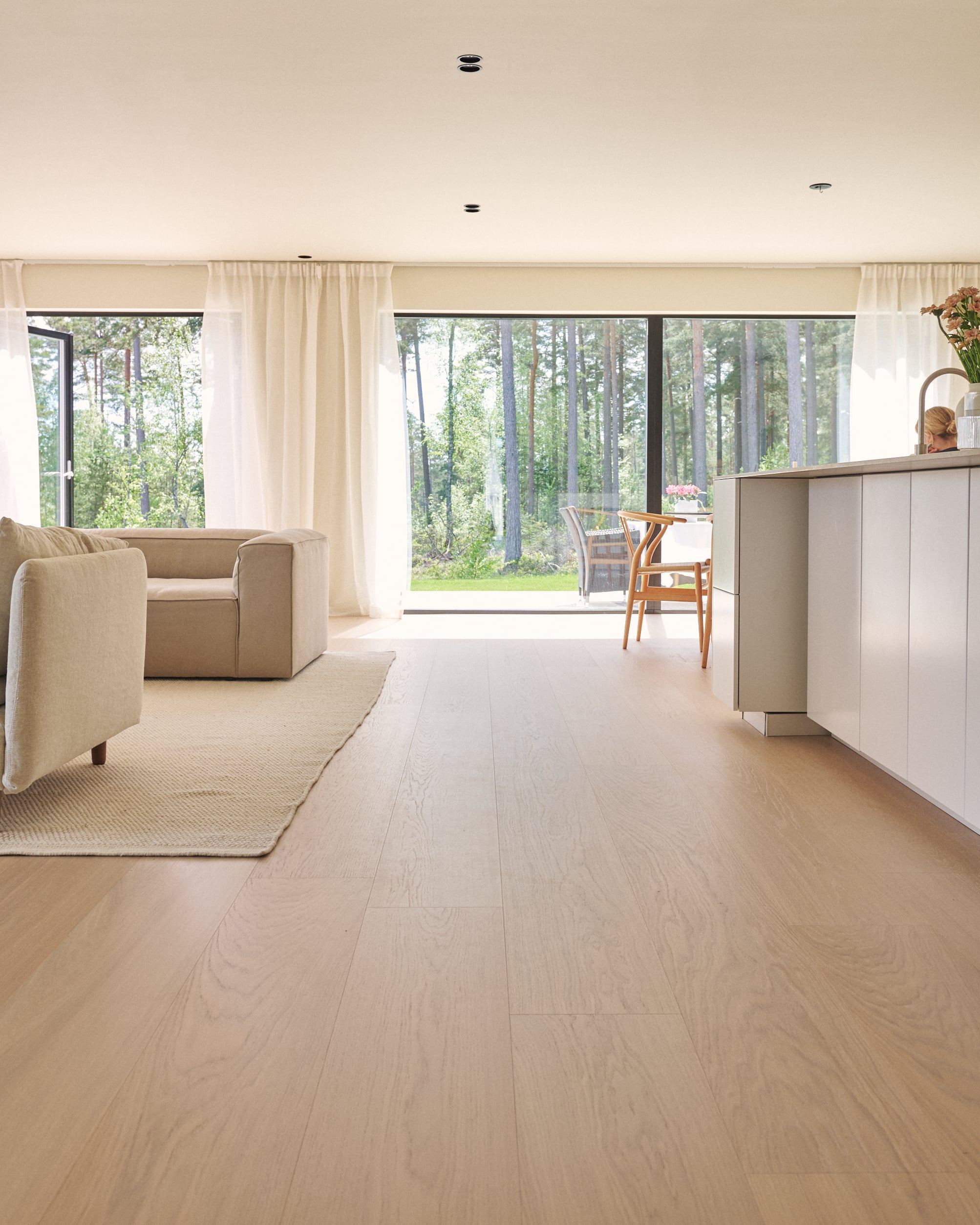
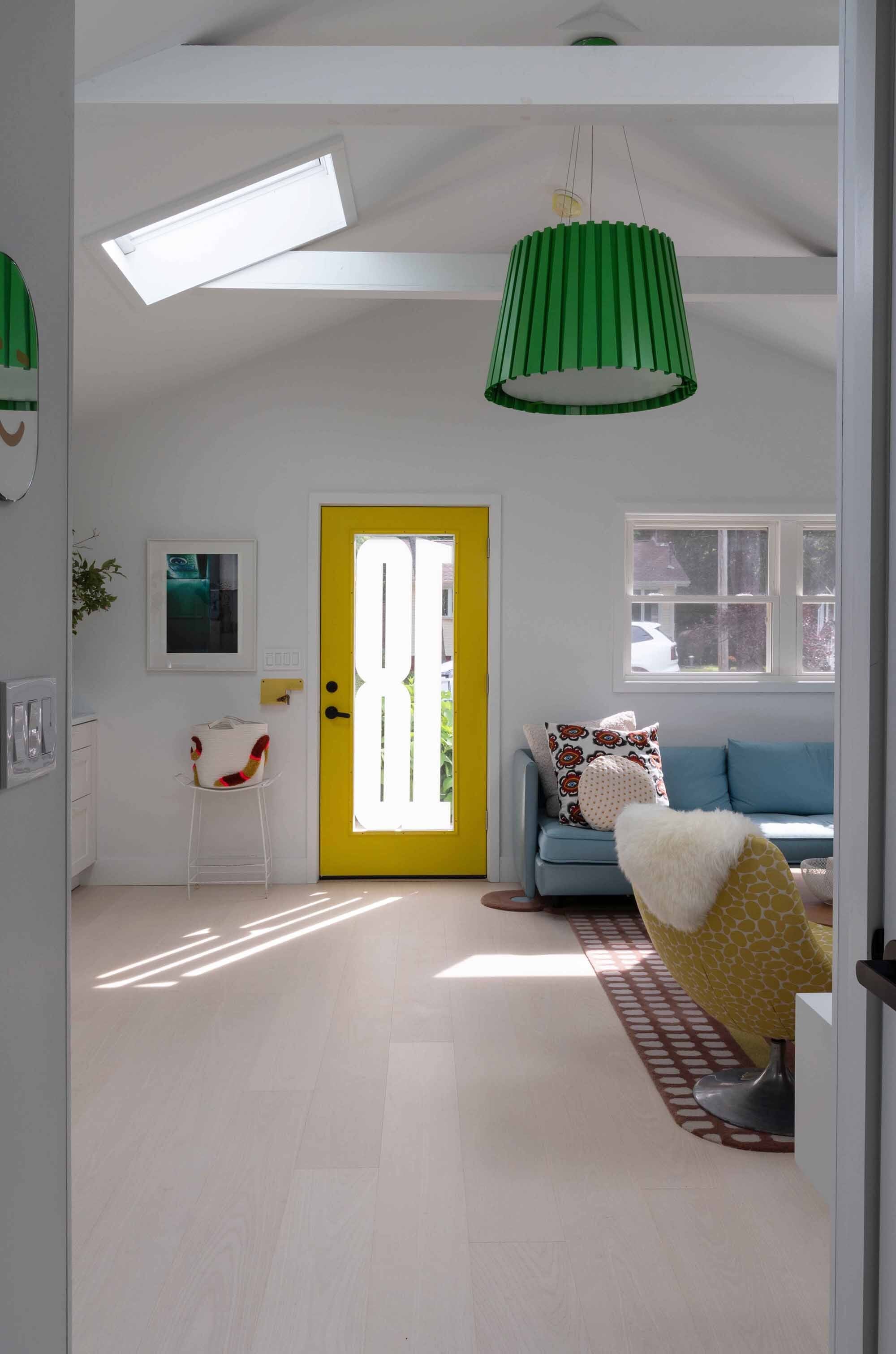
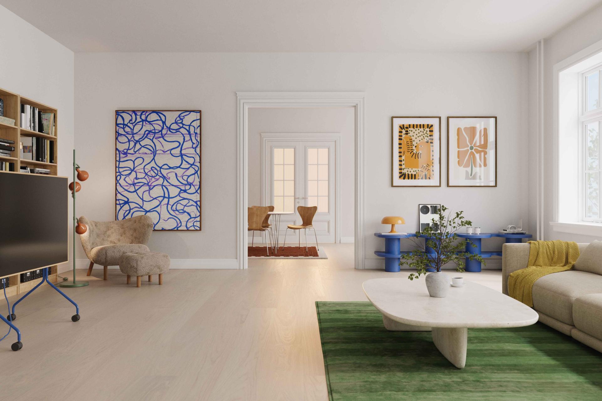
Flooring colour can dramatically alter the atmosphere of a space. Pale floors reflect light and create an airy, expansive feel, while darker tones bring a sense of depth, calm and sophistication. “When this foundation is right, everything else can then unfold naturally.”

Reading the light

Before choosing any floor colour, Mélanie Bernard believes homeowners should spend time observing how natural light moves through a room: “It’s important to observe the light at different times of the day. The same floor can look entirely different depending on orientation and light conditions. A shade that appears cool and understated in a north-facing room may feel warm and golden in a south-facing space.”

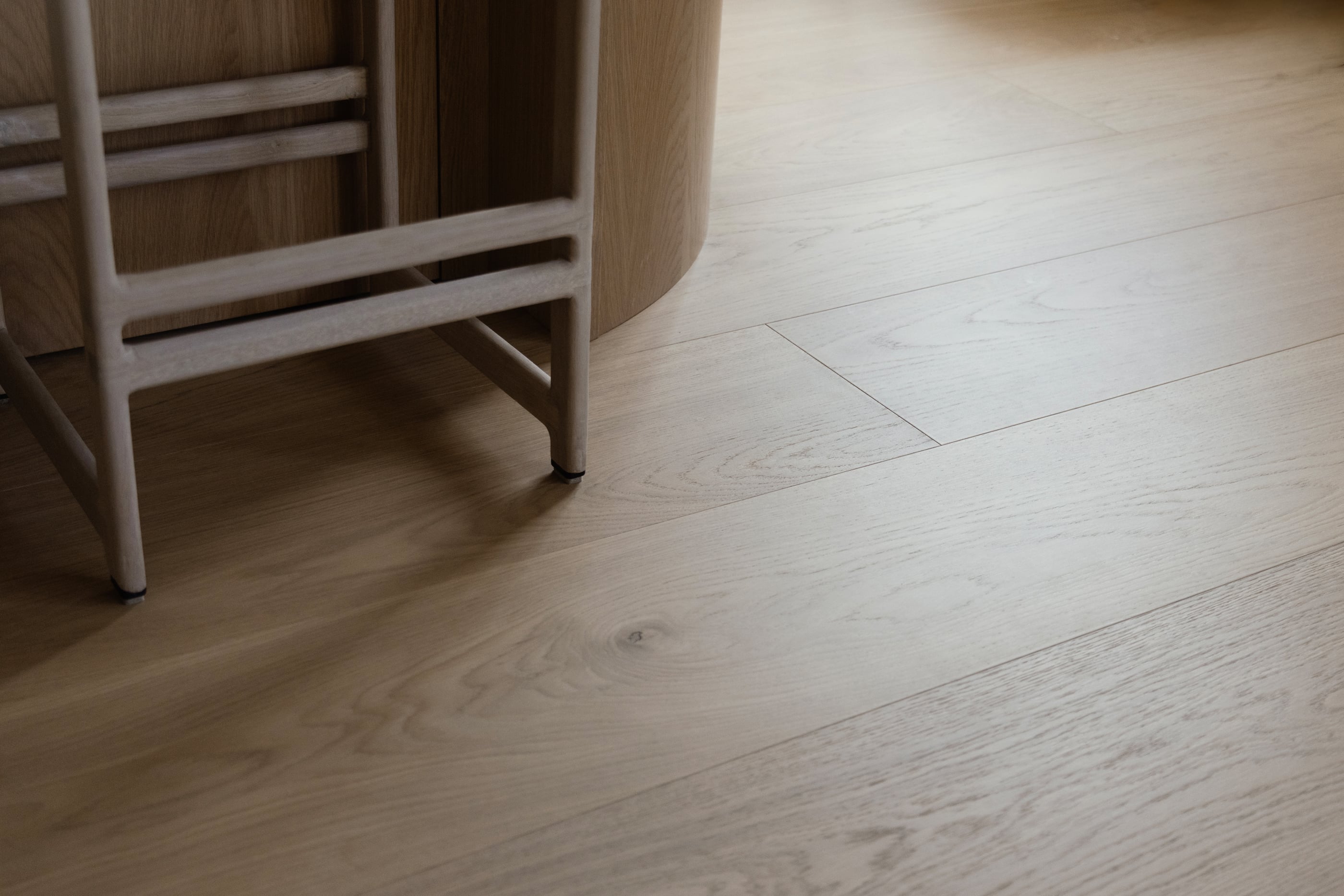
Flooring should never be considered in isolation, but as part of a broader palette, and wood flooring also adds another layer since it is constantly interacting with its surroundings. “Wood is a living material,” says Mélanie Bernard. “Its grain, density, porosity and the way it reflects light all influence how we perceive surrounding colours.”

Highly textured timber can make neighbouring colours feel calmer and richer, while smoother surfaces allow wall colours and furnishings to take centre stage.

There is also a psychological dimension at play. “Our brains instinctively associate certain colours with physical sensations,” explains Mélanie Bernard. “For example, a warm, textured wood can make a grey tone feel more welcoming.”

Choosing colours that last

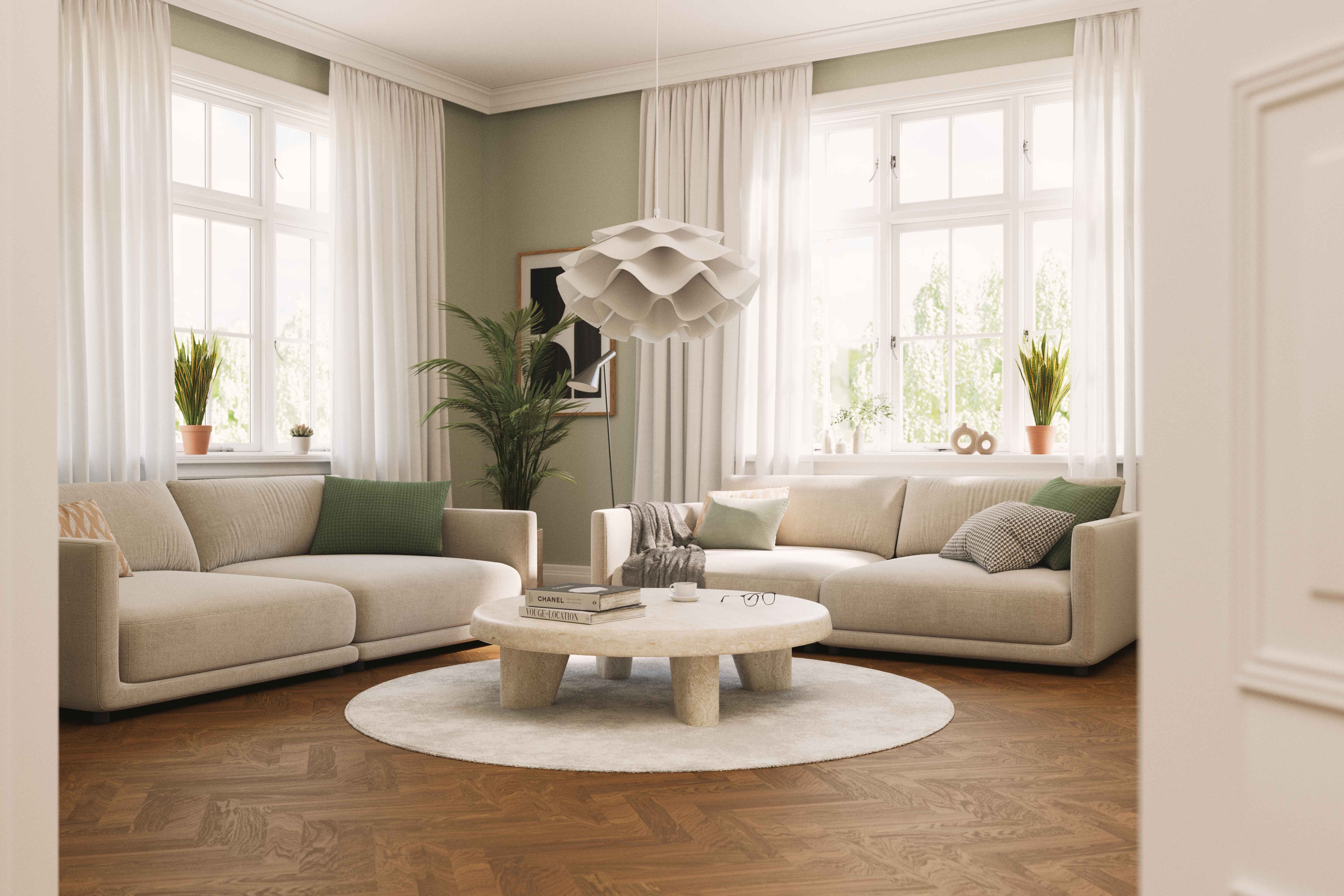
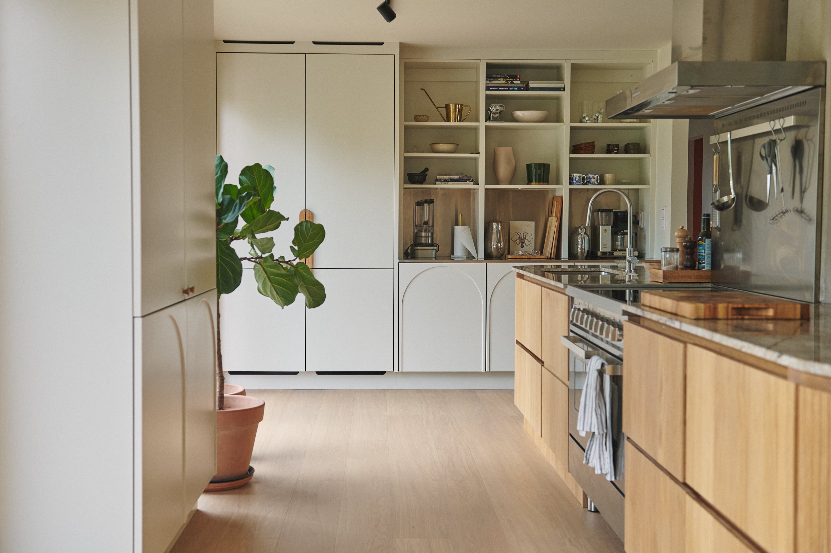
For light wood floors, Mélanie Bernard favours soft, layered palettes that allow the natural beauty of the timber to shine. “Mineral tones, off-whites, clay shades, muted greens and slightly rosy beiges create a subtle continuity that allows the material to breathe.”

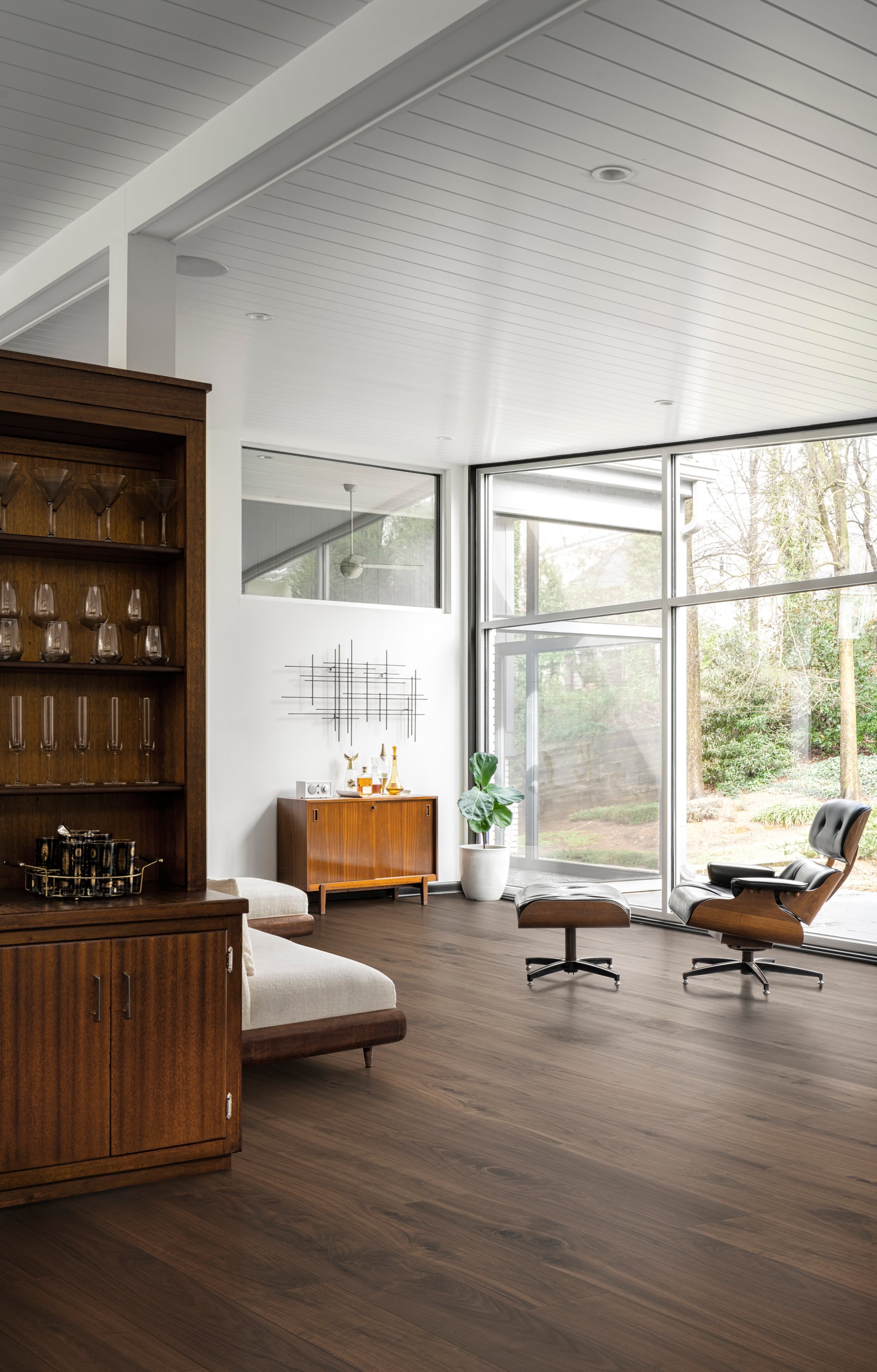
With darker floors, the focus shifts to balance. “A dark floor absorbs more light and adds density to a space.” To avoid interiors feeling heavy, she recommends introducing lighter walls and tactile materials such as linen, bouclé wool, ceramics and patinated metals.

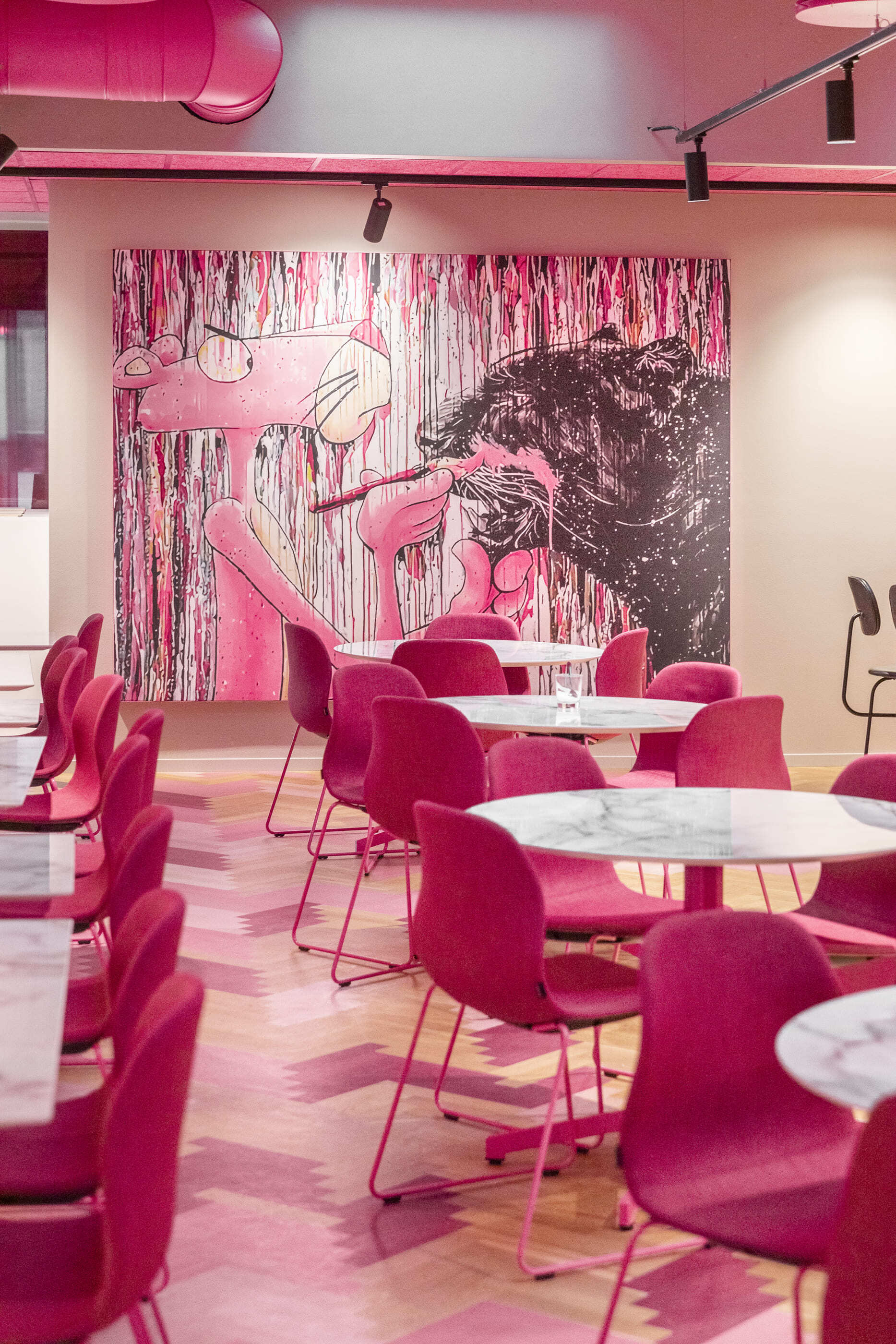
Patterned floors including herringbone require a similarly careful approach. “Herringbone creates vibration, direction and almost an architectural rhythm.” Rather than competing with the pattern, colour should support it, allowing the geometry of the floor to become part of the room’s character.

Colour can change a room's dimensions

One of colour's most remarkable qualities is its ability to alter our perception of space. Many homeowners instinctively reach for white paint in small rooms, believing it will make them feel larger. Yet Mélanie Bernard argues that softer, more nuanced colours can often be more effective. “Soft, weathered or slightly muted colours can create a very pleasant sense of enclosure.”

What tends to make rooms feel cramped is not colour itself, but excessive contrast and visual fragmentation. In larger spaces, colour can be used to establish different zones and create a sense of flow. “It becomes a tool for spatial legibility.”

Even floor colour can influence how we perceive proportions. Light floors can make rooms feel broader and more open, while darker floors strengthen the sense of grounding and intimacy.

Designing for wellbeing

Ultimately, Mélanie Bernard believes that the most successful interiors are those that use colour intentionally rather than decoratively. “A thoughtfully designed colour palette can profoundly transform the way a space is experienced. Beyond aesthetics, colour influences our emotions, our energy levels and even our behaviours.”

That philosophy extends beyond the home into workplaces, where colour and materials can help reduce sensory fatigue and create calmer, more restorative environments.
“Natural tones and authentic materials often have a regulating effect on the nervous system. They unconsciously reconnect us with something more organic.”

Perhaps the most enduring lesson is that colour should not be treated as a trend. “When colour is approached as a sensory and spatial tool rather than a decorative layer, it helps create environments that support wellbeing and enrich everyday life.” In a world obsessed with the next big look, that may be the most inspiring colour trend of all.